

Click through our interactive data analyses
Each data point on a graphic contains further information. Click on each element or hover over it with your mouse. Ah, we are designed especially for tablets. Swipe and Touch!
Hui!
This view makes me feel a bit dizzy ...
Can we please change the format to landscape ?
Our visual data analysis offers information about correlations which have not been available in this form until now. Take the downfall of the energy companies or the assault on VW as a model German company, as the result of the diesel scandal for instance. Discover how the stock markets value certain sectors. How? Through your own observation.
Each data point on a graphic contains further information. Click on each element or hover over it with your mouse. Ah, we are designed especially for tablets. Swipe and Touch!
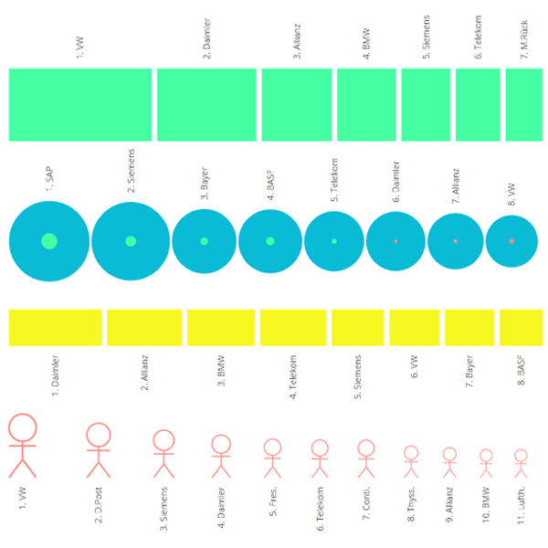
How do the most important performance indicators correlate? The stock market does its own thing. See SAP.
A ranking. How do the largest companies shape up in relation to one another? Especially with regard to their profits.
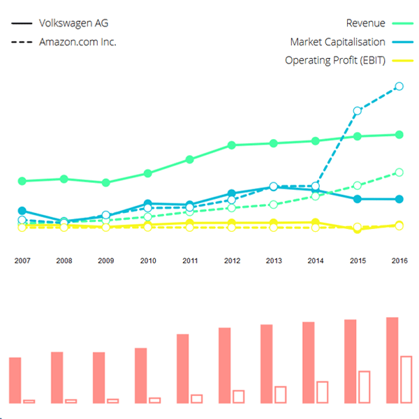
Analyse the companies side by side. Compare them with Google, Apple and Amazon.
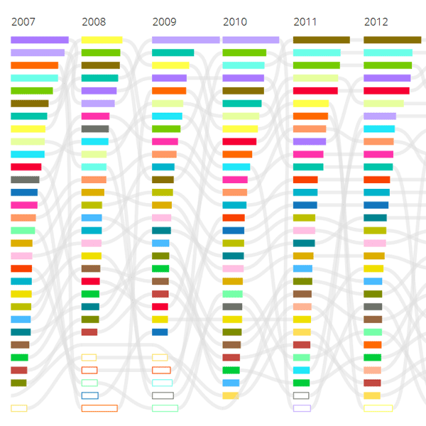
Our analyses are based on the companies' 2007-2016 annual reports (DAX 30, 18/03/18) in addition to Xetra, boerse.de and ariva.de. We update the data and expand the analyses.

Select one or two
companies
We expand this project and update the data as soon as new data sets are available.
Would you like us to let you know when an update becomes available online?
You can continue to do that: